Get more clicks on your digital call to actions with these hot tips
There’s nothing worse than spending hours meticulously designing and writing the perfect landing page, only for it to fall flat. You know it looks great. That the content is perfect. Even your distribution strategy is fool proof! So, you launch. And then… nothing. You run your report after a few days only to be dealt with an abysmal click through rate on your primary call to action. And that’s when you realise. Maybe the call to action didn’t stand out enough on the page. Perhaps it wasn’t punchy enough. Maybe it was easily missed, or perhaps just didn’t make sense to be there at all. So what’s the answer? How can you ensure your CTAs are click-tastic? Well, it’s a combination of UI art and UX science, and the solution to your CTA conundrum can be found below.
Firstly – let’s be clear on our definition of a CTA
Call to Actions, or CTAs, are prompts that push your audience to interact, engage or reach out with your brand. In the context of this article, we’re talking specifically about web-based CTAs, which most often tend to be buttons or links that have the role of directing your readers to participate in an action – normally taking the form of a ‘click’ that leads to something else – a form submission, a new page, or even a purchase. So, if you want your prospects to move down the marketing funnel and convert, your CTAs are one of, if not the most critically important elements on your web page. To truly nail your CTAs you need to ensure they’re both visible and compelling, and that tends to boil down to the following four areas:
- Placement
- Design
- Content
- Context
The golden rule for CTAs: make them as easy to see and interact with as humanly possible.
1. The Perfect Placement
Make sure your CTAs are placed somewhere they won’t be overlooked. Sounds obvious, sure, but page layout is a key part of User Experience and User Interface philosophies. Cater to the needs of your visitors and make it as easy as possible for them to click on your CTAs. Think about the following:
Doing what comes naturally
Most languages read from left to right, and top to bottom. It makes most sense to place your CTA buttons at the end of a natural flow – and that means at the end of the content. Hiding them in the middle of a text-heavy piece of content or even offsetting them away from the main content can result in them being overlooked. Sounds simple right?
Place it above the fold
Make your CTAs visible as soon as your readers land on the page. Don’t leave your visitors second guessing what you want them to do. Placing your first CTA above the fold ensures it’s instantly visible from the get go. Take a look at the excellent example below from our customer Sitecore to see what we mean:

We’re not saying ONLY place your CTAs above the fold – it’s a great idea to wrap up your web page or email by repeating your main CTA – again relating to our first point about natural placement.
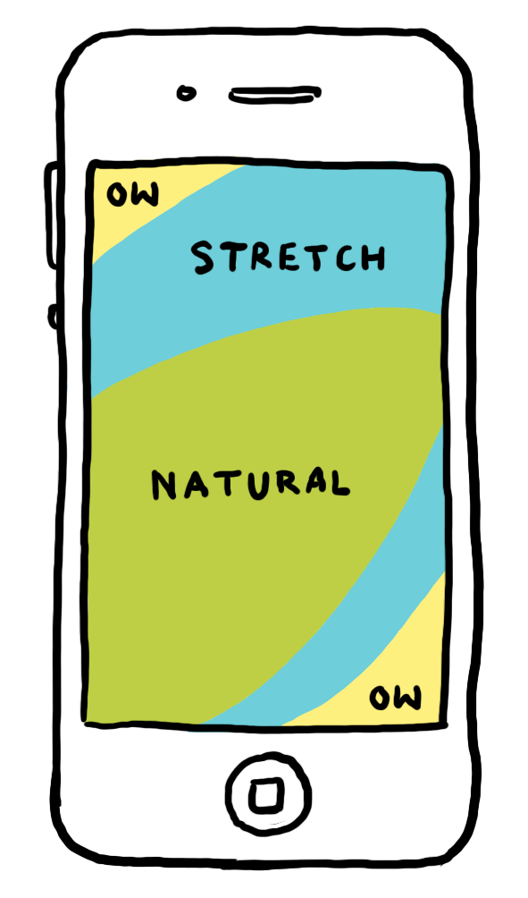
Rule of thumb: Don’t disregard mobile UX
It’s no secret that we’re addicted to our mobile phones. It’s an extremely popular method of reading content online, especially for Millennials and Gen Z users. When thinking about your CTA placement, think about your mobile users – not just in terms of visually on the screen, but also how touch screens work. Don’t overstretch your poor reader’s thumbs. Think about “the thumb zone”, like in the image below:
Negative space
Don’t be afraid of a bit of negative space. Surrounding your CTA buttons with lots of text and images can reduce the impact of the button by making it more difficult to see, or even less obvious that it’s a clickable button. Creating a nice natural border of negative or white space gives your button more prominence.
How many CTAs do you want?
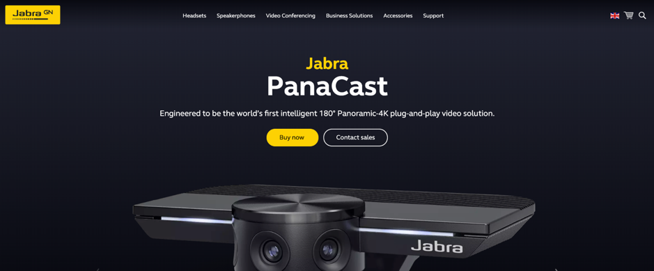
And finally, avoid confusion by offering less CTAs. We have best results when we stick to just one, but if your campaign or landing page has a secondary objective, your secondary CTA should have less weighting than your key CTA. Take a look at the example below from the wonderful Jabra – you’ll notice there are two CTAs – the first “Buy now” button is vibrant and high-contrast, while the secondary CTA is just an outline. This is commonly known as a “Ghost CTA”.
2. Standout Design
So now your placements are in the perfect place. They’re situated in the natural flow of the page, aren’t cramped by content, and aren’t overstretching your thumbs on mobile devices. Great progress, but placement is just the tip of the iceberg.
The design of a CTA is crucial for its success. You must take into account the size – whether it be the size of the font or of the actual button on the page, the colour that you choose, and also the shape of the CTA. As a form of engagement and interaction with your brand, it’s a powerful way to help build a relationship to the brand, for example by raising affinity with brand colours, motifs or logos.
Size Matters
There’s a fine balance between making your CTA button too small to interact with, and too big that it’s bolshy or perhaps doesn’t even look like a button. And, once again, you need to think about your mobile friends. We took a deep dive into Apple’s Human Interface Guidelines to understand what their recommendations were for creating adaptable CTAs. This is what they had to say about full-width CTAs:
“Inset full-width buttons. A button that extends to the edges of the screen might not look like a button. Respect the standard UIKit margins on the sides of full-width buttons. A full-width button appearing at the bottom of the screen looks best when it has rounded corners and is aligned with the bottom of the safe area—which also ensures that it doesn't conflict with the Home indicator.”
…and on general sizing for mobiles:
“Provide ample touch targets for interactive elements. Try to maintain a minimum tappable area of 44pt x 44pt for all controls.”
This second point is especially critical. If your buttons or CTAs are too small or too crowded, then the act of simply “touching” them becomes a challenge. Have you ever tried to use a non-responsive site only to leave in a fit of rage after you can’t click where you want to go? I know I have.
Colour
One day you could decide to take a dive into the psychology of colour, and never emerge. It’s so rich with fascinating theory and insights that it verges on impossible to take it all in. Colour psychology is important when it comes to CTA design, because the colours you choose could persuade or dissuade a user to click – different colours invoke different moods and emotions. Take green for example – we all know green means “go”, while red means “warning” or “stop”.
Different ‘types’ or personalities of people have varying colour preferences, for example by gender. This all stems back to designing for your personas. If you know from persona research that blue is the favourite colour of a high percentage of your target audience, maybe blue’s the right choice.
However, sometimes, the choice of your CTA colour doesn’t need any grand psychological analysis – it once again stems to user interface best practise – great contrast, great brand affinity, and maybe most importantly, great consistency.
Choosing a high contrast colour ensures your CTA stands out on the page. You want it to be noticed, without it being jarring. As part of this, you should select a colour that you don’t use frequently with other elements on the page – for example, don’t select the same colour for your CTAs that you would for non-interactive elements such as titles or backgrounds. What’s more, using the same colour for all of your CTAs across the site helps to ensure it’s clear where your interactive elements lie.
Cisco is a prime example of CTA colour done right – throughout their huge main site, the majority of their CTAs are the same shade of blue – the same as their logo – yet the rest of the site utilises other colours from their palette.

Shape
Neuro-aesthetics researchers have found that rounded corners on a CTA draws the attention of the reader to the centre of the button. When creating your CTA buttons, make sure they look like buttons. Simple is best here – 99% of the web’s buttons are round, square or rectangle, so that’s what people are looking for. Don’t go for a crazy shape. We’ve tested it – it doesn’t work!
Wow. This has turned out to be one of our meatier articles, and we’re only half way! Keep an eye out next week for part two, where we explore the final two golden rules that lead to CTA nirvana: content, and context.