The final part of your journey to CTA nirvana is here
Call to actions are a tricky beast to get right, so perhaps it’s no surprise that we soon realised that our CTA best practise blog needed to be a best practise blog two-parter. Last time, we covered placement and design, two of the four fundamentally important characteristics that we believe you need to nail to ensure CTA success. Today, we’ve covered the other two, and it’s all about content:
- The content of the CTA
- The content on the rest of the page
So without further ado, let’s jump back in by starting with those few golden words that you place on your CTA buttons…
1. Compelling Copy
“Click here”. “Download”. “Submit”. Three examples of call to actions that don’t have the best copy. We've had most success with CTAs when their content conforms to the following characteristics…
- Be concise
- Be action-oriented
- Show a benefit
…and when they never come across as a demand. You want to instil trust without scaring off your prospects, and words like “Submit” and “Download” are perhaps a tad aggressive.
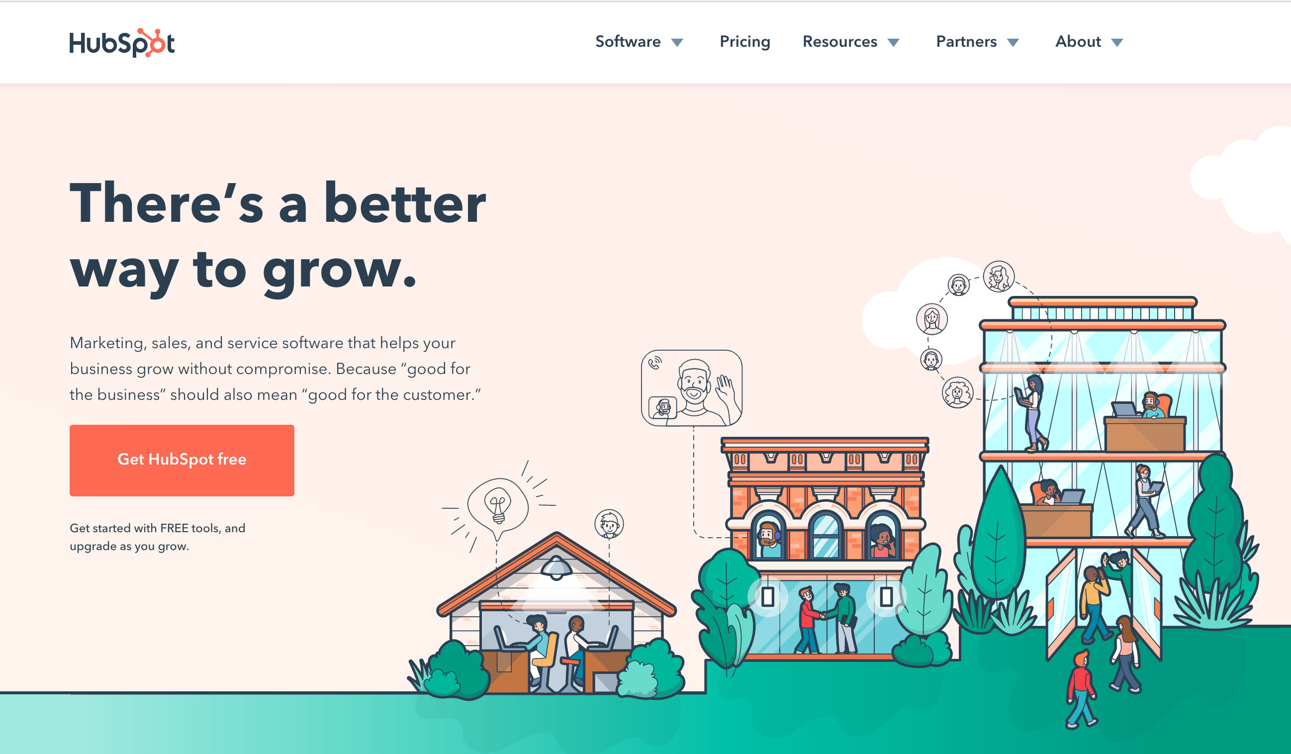
Have a look at this example from our marketing partner Hubspot:

You’ll see on this occasion, Hubspot has gone with “Get Hubspot free”.
This ticks all the boxes. “Get” is your action word, and “Free” is your benefit. It’s short, catchy, to the point, and a great offer. You know exactly what you’re agreeing to when you click, whereas something like “Click here” could take you anywhere.
Creating richer link text is also great for SEO, as it provides additional link context for web crawlers, and helps them to understand what your site is about. SEO is a completely separate kettle of fish however, and not one to dive into today!
2. Content consistency
Content is always tough to get right, especially when you’re paring it back. Starting small and adding to your content is child’s play compared to the times when you need to lay it out on the chopping board and cut material down. Unfortunately, when it comes to CTA content and landing page content, it’s typically the latter – you start with your high-value content and condense it to a point where it’s just enough information that you can hook your prospects. And that’s no easy feat.
But what’s that got to do with the CTA, you ask? Well, context and consistency is everything. Your CTA buttons or links are just one element on the page, and while the CTA is the physical “action”, you still need to persuade your visitors to click on it. And that means great content that concisely showcases your offering and compels them to continue on their user journey.
And this is where our old friends, personas, come into play. For example, at Prism, we only work with IT and Fintech customers, so our content is typically positioned to help marketing professionals in these sectors. By knowing their unique challenges, we can tailor our messaging, showcase specific benefits, and address specific areas of interest to our prospects. Even if your CTA follows “the rules” perfectly, if your offering isn’t suitable, unfortunately, your marketing campaign isn’t going to succeed.
Bonus tip: Test, test test.
Although there’s always great best practise to adhere to, at the end of the day you need to find what works for you. And that means testing. Set up controlled A/B tests to see what works best for your call to actions. Maybe one colour is more clickable than other, or perhaps five words tells a better story than three. Set up your experiments in measurable, controlled environments – never changing more than one thing at a time – and see what works best for you.
Missed Part 1 of our CTA best practise guide? Check it out here!

